Gmail's New Interface for Composing Messages
There are many tricks that let you compose a Gmail message in a new window: you can press "Shift" while clicking the "Compose" button, use the "Shift+c" shortcut or click the "pop-out" icon if you've already started to compose a message. Composing a message in a new window lets you use Gmail's search feature, read other messages and even write multiple messages at a time.
Gmail's engineers spent a lot time improving this feature, minimizing page loading time and making sure that the original message is preserved, but few people use it.
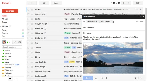
Now Google tries to bring this feature to everyone by opening a chat-like panel inside Gmail's interface when you compose a new message. It's a feature currently tested by Google that will be rolled out in the coming months.
"The new compose pops up in a window, just like chats (only larger). This makes it easy to reference any other emails without ever having to close your draft. You can even do a search or keep an eye on new mail as it comes in. And because the compose window works the same way as chats, you can write multiple messages at once and minimize a message to finish it later."

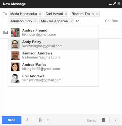
The new interface also brings a feature from Yahoo Mail: recipient boxes that can be removed or dragged and dropped to other fields ("to:", "cc:", "bcc:"). There's a new icon that shows text formatting features, an icon for attachments and a "+" icon for embedding photos, links, emoticons and Google Calendar events.

Google also improved the interface for replying, but it looks like you'll still reply inline by default. "The reply experience has been designed to fit better inline as part of your conversation - replies take up much less vertical height, intelligently expand to fit your content, and always keep the recipients and other controls in view no matter how long your message gets."
To try the new interface, open Gmail, click the "Compose" button and look for the "new compose experience" link right next to the "Labels" button. If you can't find it, you'll have to wait until it's added to your account. For now, you can switch to the old interface if you don't like the changes. Some features are not yet available in the new interface: inserting emoticons and event invitations, adding labels to outgoing messages, canned responses.
Google tried to streamline the "compose" window, so many advanced features will be more difficult to find. You'll have to click different icons to find text formatting options, add events or spell check your text. To send mail from another address, you'll have to "click into the 'To' field, then click the 'From' link to select which address you'd like to send mail from". Gmail is suddenly more difficult to use, but the interface looks better.
{ Thanks, Ben. }
Gmail's engineers spent a lot time improving this feature, minimizing page loading time and making sure that the original message is preserved, but few people use it.
Now Google tries to bring this feature to everyone by opening a chat-like panel inside Gmail's interface when you compose a new message. It's a feature currently tested by Google that will be rolled out in the coming months.
"The new compose pops up in a window, just like chats (only larger). This makes it easy to reference any other emails without ever having to close your draft. You can even do a search or keep an eye on new mail as it comes in. And because the compose window works the same way as chats, you can write multiple messages at once and minimize a message to finish it later."

The new interface also brings a feature from Yahoo Mail: recipient boxes that can be removed or dragged and dropped to other fields ("to:", "cc:", "bcc:"). There's a new icon that shows text formatting features, an icon for attachments and a "+" icon for embedding photos, links, emoticons and Google Calendar events.

Google also improved the interface for replying, but it looks like you'll still reply inline by default. "The reply experience has been designed to fit better inline as part of your conversation - replies take up much less vertical height, intelligently expand to fit your content, and always keep the recipients and other controls in view no matter how long your message gets."
To try the new interface, open Gmail, click the "Compose" button and look for the "new compose experience" link right next to the "Labels" button. If you can't find it, you'll have to wait until it's added to your account. For now, you can switch to the old interface if you don't like the changes. Some features are not yet available in the new interface: inserting emoticons and event invitations, adding labels to outgoing messages, canned responses.
Google tried to streamline the "compose" window, so many advanced features will be more difficult to find. You'll have to click different icons to find text formatting options, add events or spell check your text. To send mail from another address, you'll have to "click into the 'To' field, then click the 'From' link to select which address you'd like to send mail from". Gmail is suddenly more difficult to use, but the interface looks better.
{ Thanks, Ben. }


